Skrapp Logo has Changed: The Journey Behind Our Fresh Logo

The Skrapp Chrome extension is probably your go-to tool for finding email addresses on LinkedIn. That little blue icon?
Yes, that little blue icon is how you recognize us.
Well, we decided it was time to give that icon (and the whole Skrapp logo) a fresh new look.
Head over to our blog post to learn more about the story behind the new logo, what it looks like, and what we hope to achieve with this fresh look!
Why the Change?
We wanted a logo that screams "future of Skrapp" just as loud as our awesome email finder does!
Here's the honest truth: the old logo was just “Skrapp” written in a random Sans-serif font from way back when Skrapp was first created. It served us well, but let's face it, we could do even better!
Now that our team (and budget!) is growing, we decided to upgrade our brand identity.
We always knew a logo refresh was on the horizon, and with the successful relaunch of Skrapp Email Verifier 2.0 (think better webpage, top Google ranking, and tons of new happy customers!), the time felt just right!
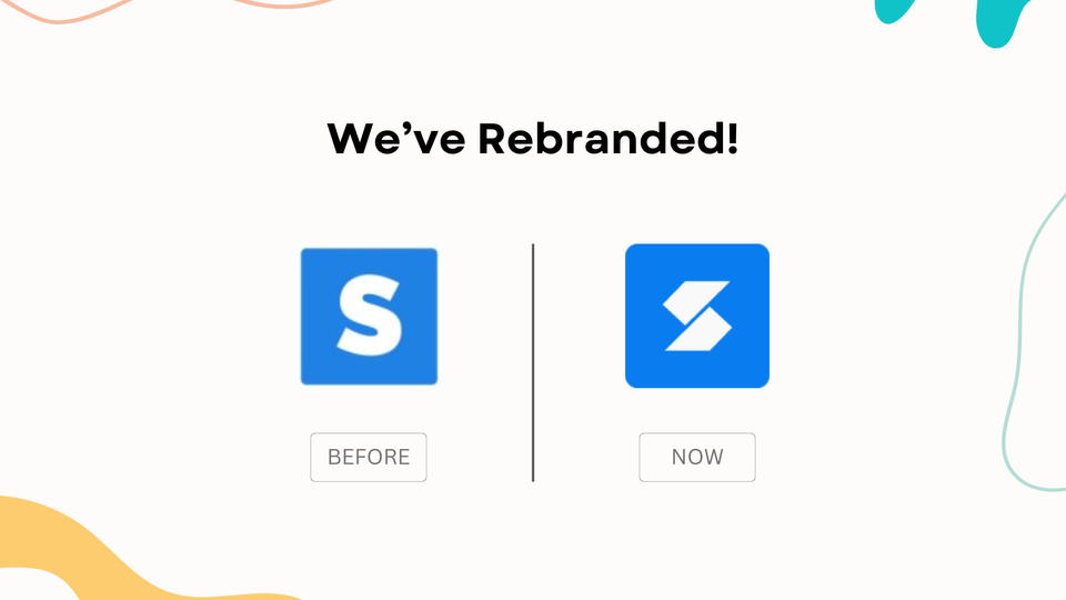
Old vs. New: A Visual Journey
Key changes:
- The "K" Factor: Our journey began with the distinctive "K" in Skrapp. Its sharp angles mirrored the dynamic movement of our favicon, hinting at the innovative spirit behind Skrapp.
- A Foundation of Stability: We opted for thick shapes to create a visual impression of strength and reliability. Skrapp is a brand you can count on!
- The Power of "S": Take a closer look at the way the two bold shapes form an "S." This design ensures Skrapp's identity is instantly recognizable, no matter how you view the logo.
Get Ready to See Skrapp's New Look Everywhere!
You'll soon be seeing our new logo across the board - website, social media, emails, and even our Chrome extension!
We're so excited about this change, and we're even working with websites that mentioned Skrapp to update their logos too.
Plus, you might see a few emails from us introducing the new logo. Don't worry, it's just a heads-up!
We have big plans for Skrapp's future, and we hope you'll be part of the journey!
Wrapping Up
We're absolutely thrilled to finally unveil Skrapp's fresh logo!
Feel free to share your feedback and suggestions – we love hearing from you.
In the meantime, keep prospecting with Skrapp, but remember to use our email verifier before hitting send – you don't want any bounces!


